
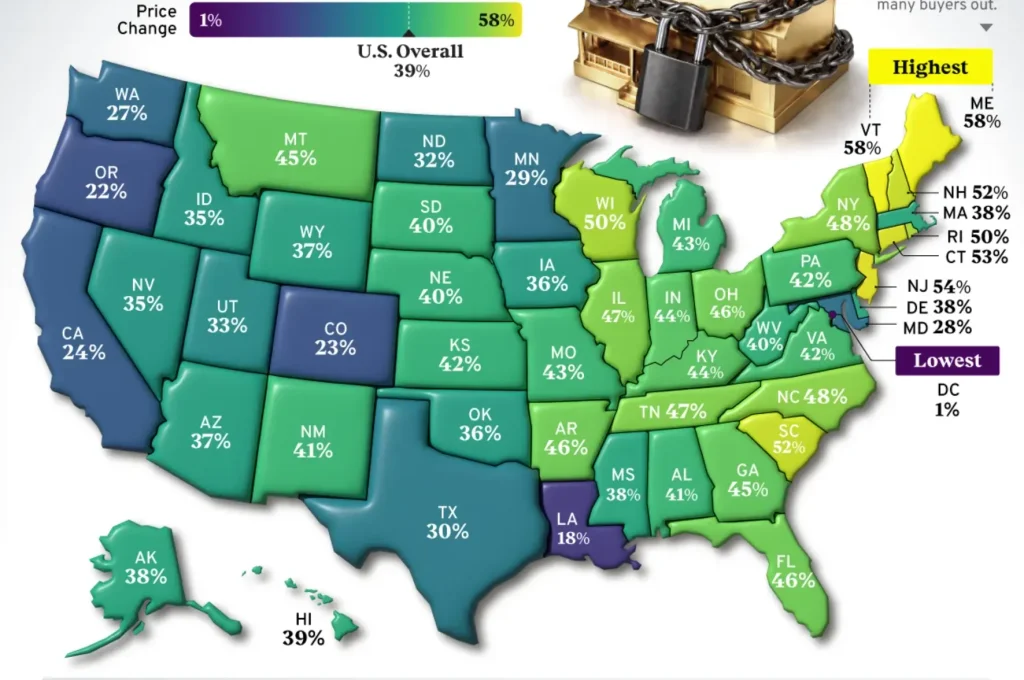
If you’ve spent any time scrolling through economics content online, chances are you’ve stumbled across one of those clean, colorful U.S. maps that make a complicated topic feel instantly understandable. Many of them come from a single source: Visual Capitalist. In June 2026, the outlet published a new analysis of the housing price surge across all 50 U.S. states (plus Washington, D.C.) for the five-year period ending in the first quarter of 2026 — and the results genuinely surprised a lot of readers, because the states at the very top of the housing price surge list weren’t California or Florida. They were Maine and Vermont.
This post breaks down, in detail, who Visual Capitalist actually is, exactly how they conducted this research, what the full state-by-state ranking looks like, and what it all means for anyone watching the broader housing price surge reshape the American real estate map.
Who Is Visual Capitalist? The Company Behind the Map
Before trusting any data visualization, it’s worth asking: who made it, and why?
Visual Capitalist was founded in 2011 by Jeff Desjardins in Vancouver, British Columbia, Canada. It uses both data visualization and infographics to showcase original research for investors on commodities and equities. What started as a niche project covering mining stocks and commodities has since grown into one of the most widely shared data-journalism outlets on the internet.
Jeff Desjardins, the founder, has an interesting backstory of his own. He holds a BCom from the Sauder School of Business at UBC, and according to his own account on the Entrepreneur on Fire podcast, he founded Visual Capitalist in 2011 after first dabbling in consulting work, eventually building it into a media site reaching millions of investors every year. One small, fun detail from that interview: when asked if he was ready to “ignite,” Jeff answered, “If you’ve got the matches, I’ve got the gasoline” — a fittingly bold line from a guy who bootstrapped a data company into a global media brand without outside funding for most of its history.
Today, the scale is hard to ignore. In 2022 alone, Visual Capitalist had 90 million visitors on its website, and today, almost 400,000 people receive its free daily email newsletter. The company has also built relationships with major institutional names — Jeff bootstrapped Visual Capitalist into a global media company with Fortune 500 clients including BlackRock, JP Morgan, New York Life, and Salesforce. That client list matters context-wise: the housing price surge graphic discussed in this article was published as a sponsored “Markets in a Minute” piece in partnership with the fintech app Plasma, a detail worth knowing since it explains the cashback ad you’ll see if you visit the original page. Sponsorship funds the production of the chart, but the underlying housing data itself comes from a separate, independent government source, which we’ll get to next.
It’s also worth noting that Visual Capitalist now publishes much of its day-to-day content through a sister platform called Voronoi, a free mobile app for data-driven visuals, while VisualCapitalist.com remains the flagship website for long-form graphics like this housing price surge map.
How the Research Was Actually Done
This is the part most blog posts skip, but it’s the part that matters most if you actually want to trust the numbers.
The housing price surge map was created by Visual Capitalist in partnership with Plasma, as part of their ongoing Cost of Living series that tracks the financial challenges people face today. But the underlying housing numbers themselves are not Visual Capitalist’s own invention — they come from a well-established U.S. government agency.
The data source: the report draws on the U.S. Federal Housing Finance Agency (FHFA), specifically the FHFA House Price Index. According to the chart’s own sourcing note, price changes shown are seasonally adjusted and nominal figures for the five-year period ending in the first quarter (Q1) of 2026.
What does that actually mean in plain English?
- “FHFA House Price Index” — this is a long-running, well-respected price index that the U.S. government’s housing regulator uses to track how home values shift over time, based on mortgage data tied to Fannie Mae and Freddie Mac.
- “Repeat-sales methodology” — rather than just averaging whatever homes happened to sell in a given quarter (which can be skewed if, say, a lot of mansions sell one quarter and a lot of starter homes sell the next), the FHFA index specifically tracks the same individual properties as they are bought and sold (or refinanced) multiple times over the years. It is a repeat-sales index, meaning it measures average price changes in repeat sales on the same properties, which makes it one of the more statistically reliable ways to measure genuine price movement rather than just a shift in what types of homes happened to trade hands.
- “Seasonally adjusted” — raw housing data swings up and down depending on the time of year (more families buy in summer, fewer in winter), so this adjustment smooths out those seasonal blips to reveal the underlying trend.
- “Nominal” — the figures are not adjusted for inflation. This is an important caveat for any savvy reader: part of that 58% headline number in Maine reflects genuine demand-driven appreciation, but part of it also simply reflects five years of higher overall price levels across the economy.
So, in short: Visual Capitalist didn’t run its own independent housing survey. Its real skill — and the reason its content goes viral as often as it does — is taking dense, often dry government datasets like the FHFA index and turning them into something an average reader can understand in under two minutes. That’s a legitimate and valuable form of journalism, but it does mean the real “research” credit belongs jointly to the FHFA (for collecting the housing data) and Visual Capitalist’s design team (for making it digestible).
The Full Ranking: Every State’s Housing Price Surge, 2021–2026
Here is the complete, verified list of housing price surge percentages by state, covering the five-year window from Q1 2021 to Q1 2026, exactly as published.
| Rank | State | 5-Year Price Change |
|---|---|---|
| 1 (tie) | Maine | 58% |
| 1 (tie) | Vermont | 58% |
| 3 | New Jersey | 54% |
| 4 | Connecticut | 53% |
| 5 (tie) | South Carolina | 52% |
| 5 (tie) | New Hampshire | 52% |
| 7 (tie) | Wisconsin | 50% |
| 7 (tie) | Rhode Island | 50% |
| 9 (tie) | North Carolina | 48% |
| 9 (tie) | New York | 48% |
| 11 (tie) | Illinois | 47% |
| 11 (tie) | Tennessee | 47% |
| 13 (tie) | Ohio | 46% |
| 13 (tie) | Florida | 46% |
| 13 (tie) | Arkansas | 46% |
| 16 (tie) | Georgia | 45% |
| 16 (tie) | Montana | 45% |
| 18 (tie) | Kentucky | 44% |
| 18 (tie) | Indiana | 44% |
| 20 (tie) | Michigan | 43% |
| 20 (tie) | Missouri | 43% |
| 22 (tie) | Kansas | 42% |
| 22 (tie) | Pennsylvania | 42% |
| 22 (tie) | Virginia | 42% |
| 25 (tie) | New Mexico | 41% |
| 25 (tie) | Alabama | 41% |
| 27 (tie) | West Virginia | 40% |
| 27 (tie) | South Dakota | 40% |
| 27 (tie) | Nebraska | 40% |
| 30 | Hawaii | 39% |
| 31 (tie) | Massachusetts | 38% |
| 31 (tie) | Alaska | 38% |
| 31 (tie) | Mississippi | 38% |
| 31 (tie) | Delaware | 38% |
| 35 (tie) | Arizona | 37% |
| 35 (tie) | Wyoming | 37% |
| 37 (tie) | Oklahoma | 36% |
| 37 (tie) | Iowa | 36% |
| 39 (tie) | Nevada | 35% |
| 39 (tie) | Idaho | 35% |
| 41 | Utah | 33% |
| 42 | North Dakota | 32% |
| 43 | Texas | 30% |
| 44 | Minnesota | 29% |
| 45 | Maryland | 28% |
| 46 | Washington | 27% |
| 47 | California | 24% |
| 48 | Colorado | 23% |
| 49 | Oregon | 22% |
| 50 | Louisiana | 18% |
| 51 | District of Columbia | 1% |
Source: U.S. Federal Housing Finance Agency. Price changes are seasonally adjusted and nominal for the five-year period ended Q1 2026.
A few things jump out immediately from this housing price surge table. First, the states at the very bottom aren’t struggling, declining markets — even Washington, D.C., at the very bottom, still posted a small positive gain. This is a story of who surged the most, not who lost value. Second, notice how the Northeast utterly dominates the top of the list, while several traditionally “hot” pandemic-boom states like Texas, Colorado, and especially California now sit much further down the table than most people would assume.
The Story Behind the Numbers: Why Maine and Vermont Won
This is where the housing price surge data gets genuinely interesting — and a little funny, in an only-in-New-England kind of way.
Maine, the #1 state, saw home prices climb more than 58% between the first quarter of 2021 and the first quarter of 2026. To put that gap in perspective: average income in the same period rose by just 16% from 2021 to the end of 2025 — meaning home prices grew roughly 3.6 times faster than paychecks did. According to the report, the state’s housing market faced a perfect storm of limited supply, an influx of remote workers, and strong demand driven by Maine’s natural beauty and quality of life.
Picture the scene: it’s 2021, the pandemic has just taught millions of office workers that they can do their job from anywhere with Wi-Fi, and suddenly a quiet coastal town in Maine — known more for lobster traps and lighthouses than corporate headquarters — becomes a dream relocation spot. Inventory was already tight before any of this started. Add a wave of laptop-toting new residents competing for a shrinking pool of homes, and you get exactly the kind of imbalance that sends prices climbing nearly 60% in five years.
Vermont, tied for #1, tells an almost identical story. Vermont had the second-highest housing price growth of just under 58%. Similar to Maine, the state saw an influx of remote workers seeking more space and a higher quality of life. But Vermont’s situation comes with an extra structural wrinkle that makes it arguably even more dramatic: Vermont’s housing market faces additional challenges with high construction costs and strict zoning that limits multifamily developments. With a slow pace of home building, there simply aren’t enough homes: it’s estimated that Vermont needs 24,000–36,000 more year-round homes by 2029 to meet demand.
Here’s the part that genuinely surprised me while researching this: Vermont’s housing crunch is so severe that it’s spilling directly into the rental market too. Vermont’s rental vacancy rate is as low as 1% in some places, and one in four renters pay more than 50% of their income on housing costs. Think about that for a second — a state famous for maple syrup, ski resorts, and Ben & Jerry’s now has rental vacancy rates so tight that finding an apartment in some towns is statistically harder than getting into an Ivy League school.
The Northeast cluster doesn’t stop there. New Jersey (54%), Connecticut (53%), and New Hampshire (52%) round out a top tier where, as the report notes about the broader trend, the highest housing market growth was primarily in Northeastern states, which have inventory far below pre-pandemic levels, and higher incomes that are better able to support higher home costs.
South Carolina, the outlier (#5, tied at 52%), is the one state in the top five that breaks the Northeastern pattern entirely. While four of the five states with the biggest price jumps are in the Northeast, South Carolina bucks this trend. The state had the fastest per-capita population growth in the country in 2025, with strong job growth continuing to attract new residents and boost housing demand. In other words, South Carolina earned its spot the old-fashioned way — through genuine economic momentum and people physically moving there, rather than a supply-shortage squeeze.
[Image: A regional map-style infographic illustrating how U.S. housing market trends vary by state. Source: Coldwell Banker Blue Matter, “State By State Housing Market Infographic”]
The Bigger Picture: Why This Housing Price Surge Matters
Visual Capitalist frames this housing price surge data within a larger affordability story, and the numbers behind that story are arguably even more striking than the state rankings themselves.
The national house price-to-income ratio, one measure of housing affordability, has climbed from 3.5 in 1985 to 5.1 in 2025 — meaning the typical American home now costs more than five times the typical household’s annual income, compared with roughly three-and-a-half times back in the mid-1980s. A related Visual Capitalist analysis puts real dollar figures behind that ratio: in 2025, the median price for an American home was $416,900, up from $82,800 in 1985 — meanwhile median household income rose by 252% over that same period, while home prices surged by 403%. Home prices, in short, have been winning a race that incomes simply can’t keep pace with.
That gap is exactly why a housing price surge story like this one resonates so widely. It isn’t just a curiosity about which state has the prettiest real estate map — it’s a window into why an entire generation of younger Americans is finding the traditional path to homeownership harder than it was for their parents.
A Few Genuinely Surprising Takeaways
To wrap up the analysis, here are the details that stood out most while digging through this housing price surge data:
- New England, not the Sun Belt, won this round. After years of headlines about Florida, Texas, and Arizona booming during the pandemic, it’s the quiet, cold, lightly populated states of Maine and Vermont that posted the single largest five-year housing price surge in the entire country.
- California ranked surprisingly low (47th of 51). With a five-year gain of just 24%, California’s housing price surge actually trailed places like Ohio, Arkansas, and Tennessee — a reminder that “expensive” and “fastest-growing” are two very different things. California’s homes were already extremely pricey before 2021, so even a smaller percentage increase still represents an enormous dollar amount.
- Washington, D.C. essentially flatlined. At just 1% growth over five years, the nation’s capital had, by far, the weakest housing price surge of anywhere measured — a striking contrast to neighboring states.
- Zoning laws, not just demand, are doing a lot of the work. Vermont’s predicament shows that a housing price surge isn’t always about a flood of buyers — sometimes it’s about a state simply being unable to build new homes fast enough, regardless of how many people want to live there.
Sources and Further Reading
For full transparency and so you can verify everything yourself, here are the primary sources used for this article, all clickable:
- Original Visual Capitalist article: U.S. Housing Market: Home Price Growth by State (2021–2026)
- Underlying data source: U.S. Federal Housing Finance Agency – House Price Index Report, Q1 2026
- Related Visual Capitalist piece on affordability: Why U.S. Homes Feel Pricier: House Prices vs. Income (1985–2025)
- Related Visual Capitalist piece: Charted: American Income vs. Home Prices (1985–2025)
- About Visual Capitalist and founder Jeff Desjardins: Visual Capitalist – About | Innovations of the World profile
Disclaimer: This article is for informational and educational purposes only and does not constitute financial, investment, or real estate advice. Housing markets vary significantly by city and neighborhood even within the same state — always consult a licensed real estate professional or financial advisor before making property decisions.